How Can Shopify Collection List sections Show Store Products?
Tutorials & Tips
5 Min Read
Shopify collections group products, guide shoppers and improve browsing. Learn how to showcase products using a collection list with simple & practical steps.
Shoppers do not want to work hard. They want to find products fast. That is why Shopify Collection List sections matter. They group products in a way that feels natural. They also make browsing smoother, especially on mobile.
A collection list helps even more. It puts your key collections in one clear section, It's visual, and clean. And it can drive more clicks when it is placed with intent.
This guide shows how to showcase your products using a collection list. It also covers common mistakes, so your section looks sharp and works well.
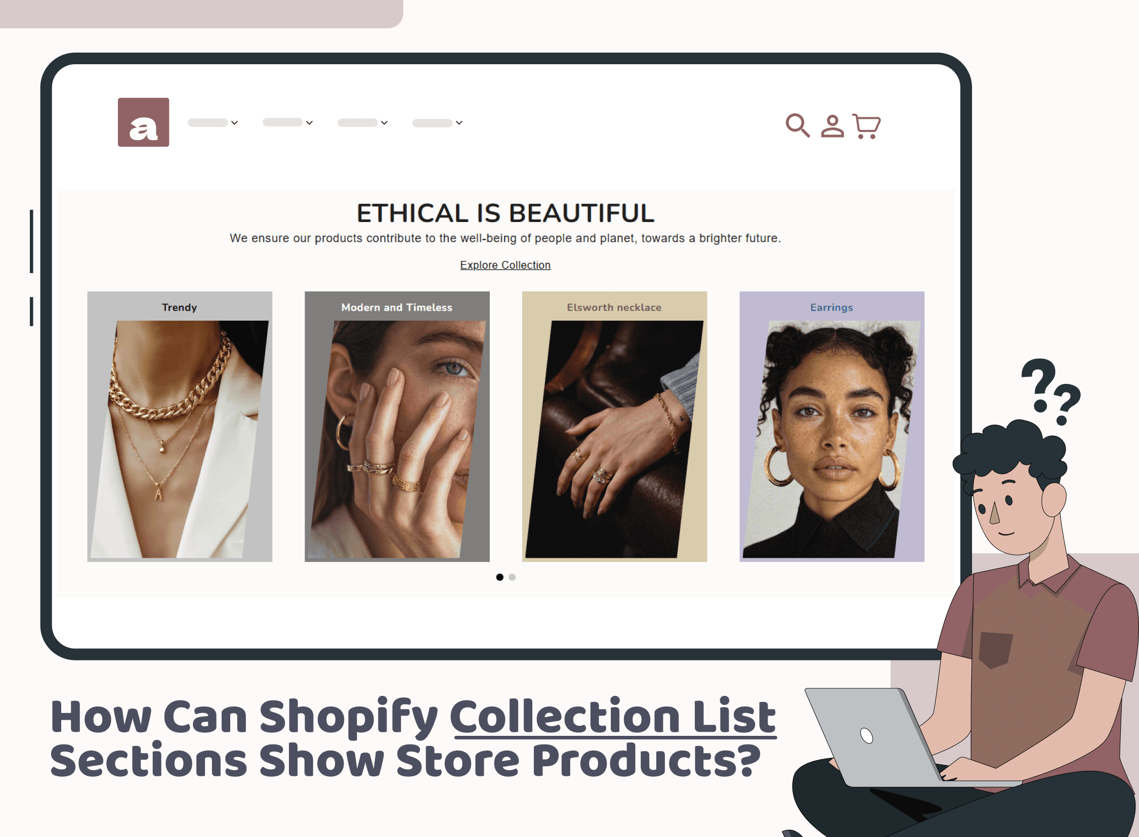
What a collection list does for your store
A collection list is a section that displays multiple collections together. Each card usually includes an image and a title. When a shopper clicks, they land on that collection page.
It sounds simple. However, it solves real store problems.
It reduces scrolling. It also reduces decision fatigue. In addition, it helps shoppers understand what you sell in seconds. Once your navigation is clear, Shopify Collection List sections do more than organize products. They guide the path to purchase.
When a collection list works best
You can use a collection list in many places. Still, a few spots tend to perform best.
Start with the homepage. Place it close to the top, often right after your hero banner. That catches attention while intent is high.
Next, use it on a “shop all” or category hub page. That helps people choose a direction without bouncing.
You can also use it for seasonal pushes. For example, gifting, summer edits, or clearance.
If your catalog is growing, Shopify collection list sections become even more important. Without them, shoppers rely on search. Unfortunately, not everyone uses search, and many searches fail when wording does not match.
Set up Shopify collection list sections before you design the list
Design works best when your structure is strong. So, take a few minutes to plan your collections first.
Group products the way shoppers think
Use customer language. Avoid internal naming. In other words, name categories the way people would say them out loud.
Avoid overlap
Overlapping collections confuse shoppers. If “Shoes” and “Footwear” lead to similar products, pick one.
Keep the featured set focused
A collection list is not meant to show everything. It should highlight the most useful paths. Often, 6 to 10 collections is enough.
With this approach, Shopify collection list sections become a browsing tool, not just an admin feature.
How to showcase products using a collection list
Here is a practical workflow you can follow.
1) Pick one goal for the section
First, decide what you want the collection list to accomplish.
Common goals include:
Help new visitors shop by category
Highlight best sellers by theme
Support a seasonal campaign
Push higher-margin categories
Once you choose a goal, selecting Shopify collection list sections for the section becomes easier. You stop guessing. You start curating.
2) Choose strong collection images
Images drive clicks. So, make them work for you.
Pick images that are:
Clean and readable at small sizes
Consistent in lighting and style
Focused on product, not background clutter
If one product photo cannot represent the category, use a lifestyle image. Alternatively, use a simple collage. Either way, keep the look consistent across the row.
3) Write short, clear titles
Short titles scan better. They also look cleaner on mobile.
Good examples:
New Arrivals
Best Sellers
Under $50
Office Ready
Gift Ideas
Clear titles make Shopify collection list sections feel effortless to explore.
4) Choose the right layout: grid or slider
Layout affects readability. It also affects how many options shoppers actually notice.
A grid usually works best when:
You have fewer collections
You want them visible at once
Your images are uniform
A slider can work well when:
You have more collections
Mobile is the priority
You want a more editorial feel
Even then, keep the first few cards strong. Most people will not swipe forever.
5) Add gentle cues for interaction
Many collection cards are clickable by default. Still, small cues help people understand what to do.
A subtle hover effect can help on the desktop. A short line like “Shop by category” can help above the section. Keep it light, though. Clarity matters more than extra text.
6) Place it where it supports the journey
Placement is strategy. It is not decoration.
A common homepage flow looks like this:
Hero banner
Collection list
Featured products
Social proof
Brand story
If you want more ideas for clean section layout, Iconic Sections has a helpful post on improving store design that fits well with this approach
When the section sits in the right place, Shopify collection list sections start doing real work. They reduce friction. They improve flow.
Quick reference table for building a strong collection list
Use this table as a build guide while you design.
Element | Best practice | Why it helps |
Collection count | Feature 6 to 10 | Keeps decisions simple |
Images | Same style and crop | Improves visual trust |
Titles | 2 to 3 words | Makes scanning easier |
Order | Best sellers first | Matches shopper intent |
Spacing | Add breathing room | Keeps it premium |
How Shopify collection list sections support SEO and discovery
Collections are not only for navigation. They also support discoverability when you structure them well.
Each collection page can act like a category landing page. That gives search engines more context. It also gives shoppers more entry points.
To improve results:
Write unique collection descriptions
Keep titles clear and aligned with search intent
Avoid thin collections with only a few products
Link to important collections from key pages
For a clear overview of how collections work and how they are set up, Shopify’s documentation is a solid reference.
When you build Shopify collection list sections with intent, you improve browsing and site structure at the same time.
This does not require a full redesign. It is often a simple swap. Still, it keeps Shopify collection list sections aligned with what shoppers want right now.
Conclusion
A collection list is one of the simplest ways to make your store easier to shop. It turns browsing into clear choices. It also helps shoppers reach the right products faster. That matters on every device, but it matters most on mobile.
Start with a small set of Shopify collection list sections that reflect how people actually shop. Then keep the images consistent and the titles clear. Finally, place the section where it supports the journey instead of interrupting it.
When you treat Shopify collection list sections as navigation, not decoration, your storefront feels more organised. As a result, shoppers click with more confidence and find what they want sooner.
Join our newsletter list
Sign up to get the most recent blog articles in your email every week.
Similar Topic


